
Masterpass Merchant Portal
Role: Lead UX Designer, User Research, User Testing, Wireframing, Prototyping, UI Design
Mastercard's digital payment product Masterpass is a digital wallet that allows you to check out faster without the need for physical cards or cash. The Masterpass merchant portal is where business owners and service providers can manage their Masterpass settings for shipping, payments, and other credentials.
I led the design for this project as it went through 3 different redesigns. As Masterpass evolved, the capabilities increased and changes to the design were made to accommodate for the product's needs.
The before state
The Masterpass Merchant portal was a portal that existed on its own platform that was linked from the Masterpass.com website. This was the only point of entrance for the user to access in order to get to the portal. The Masterpass.com website promotes Masterpass as a product for consumers, merchants, and issuers at the same time so the merchant portal call to action did it's best to stand out on the site, however suffered from lack of traffic and confusing user experience.
Problems
The Merchant portal suffered from lack of traffic because it was hard to find, and required a very complicated way of login that hindered the use of the portal. The portal also followed a different design language from the rest of the Masterpass products that made it seem like a foreign product offered by a different company. But most importantly, the portal was designed without a clear picture of who the user is and what their intent on being on the portal was. It was clear as to what Masterpass wanted the user to do, get this customer to buy our product, but that may not be what the user was on the platform for and there were no resources for the user to be empowered to go about doing what they wanted to do on the portal.
Project creation
Creating a Masterpass merchant account required over a dozen steps in order for the user to get approved to begin using the merchant portal. In no way was the experience "simple, easy onboarding for any merchant", which was how it was marketed. The wires below show that creating the profile required the user to enter their legal business name, receive a verification, which then led to a page notifying the user that it will take them 3-5 business days to approve the account.
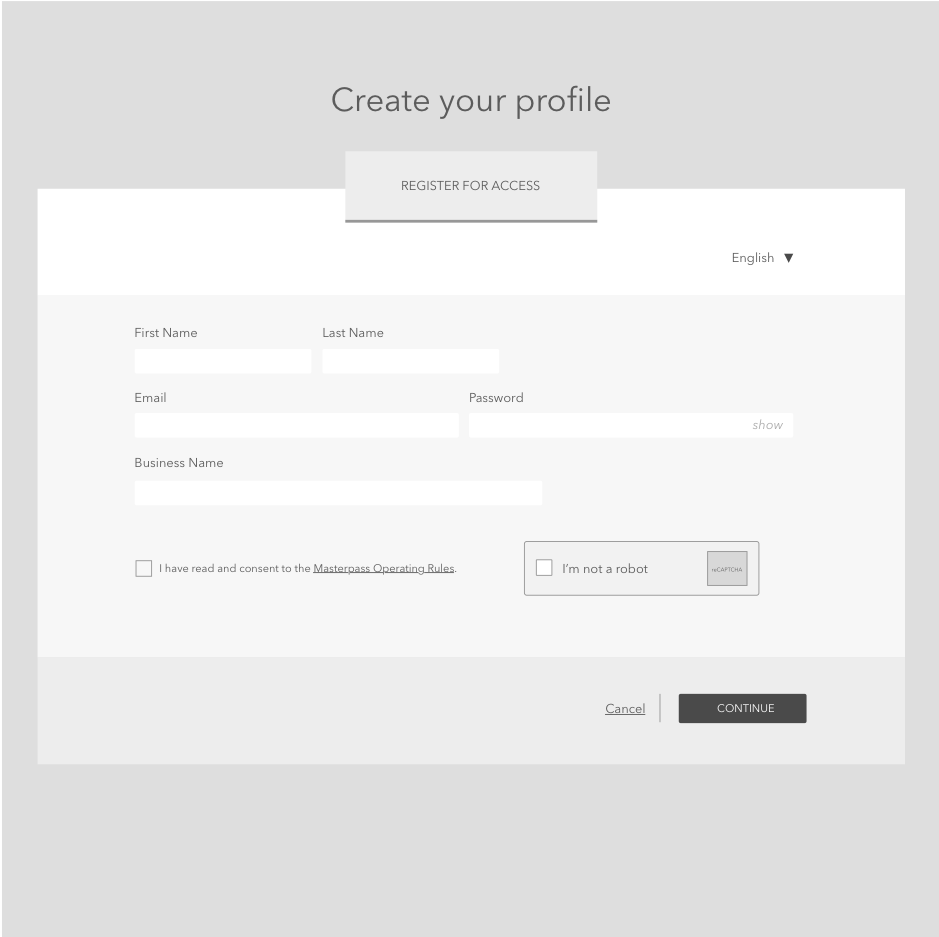
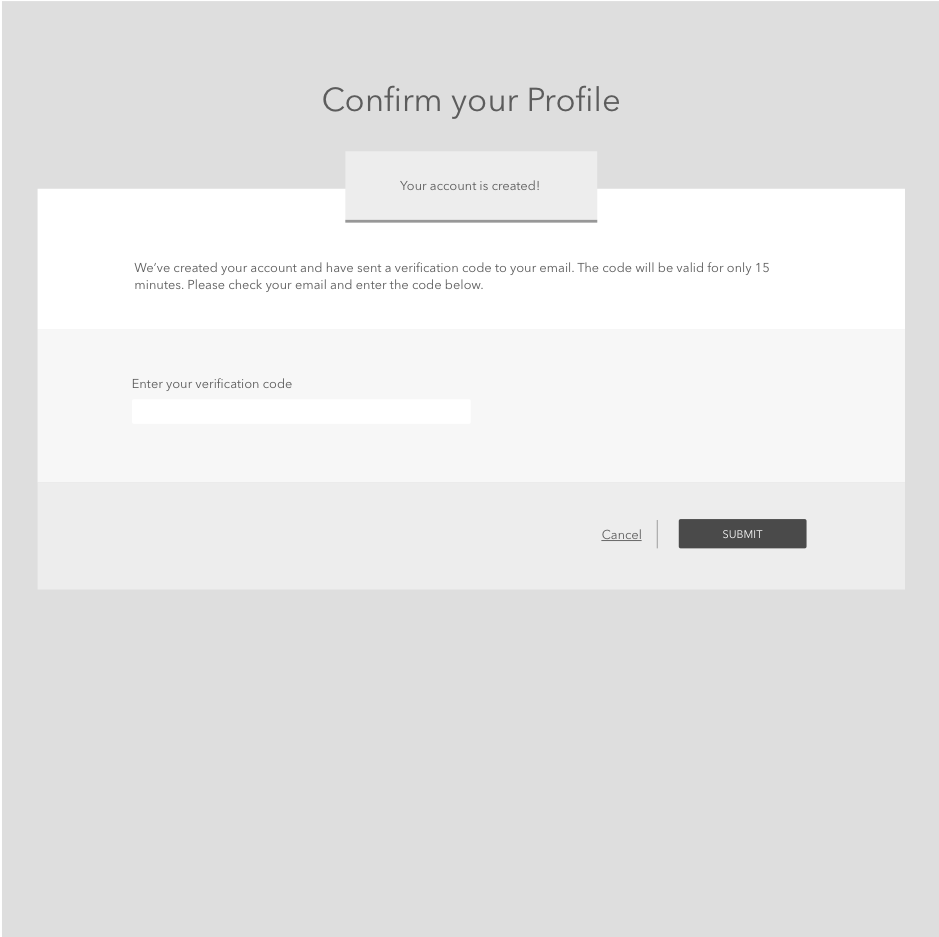
Technical lifts needed to happen in order to streamline the account creation process. What were these verification codes needed for exactly? Why does it take 3-5 business days for a merchant to receive approval? What if the user didn't have a legal business name yet to create an account and just wanted to see the capabilities of the product? Was it even possible to see any of the capabilities prior to creating an account? How will the user know this is the right product for them if they don't know any of this?
Merchant Dashboard
Once a user was approved for an account and could log in, they were immediately dropped onto the merchant dashboard.

The dashboard had a "quick start" menu so the user could access the immediate items for them to begin their project. But it wasn't clear what any of this information was and who it was for. The Masterpass Merchant API was a technical implementation that needed to be completed by a developer, but it was unclear who the audience for the dashboard was. Bandaids like "Invite a Developer!" buttons existed so you can add team members to the project.
Support
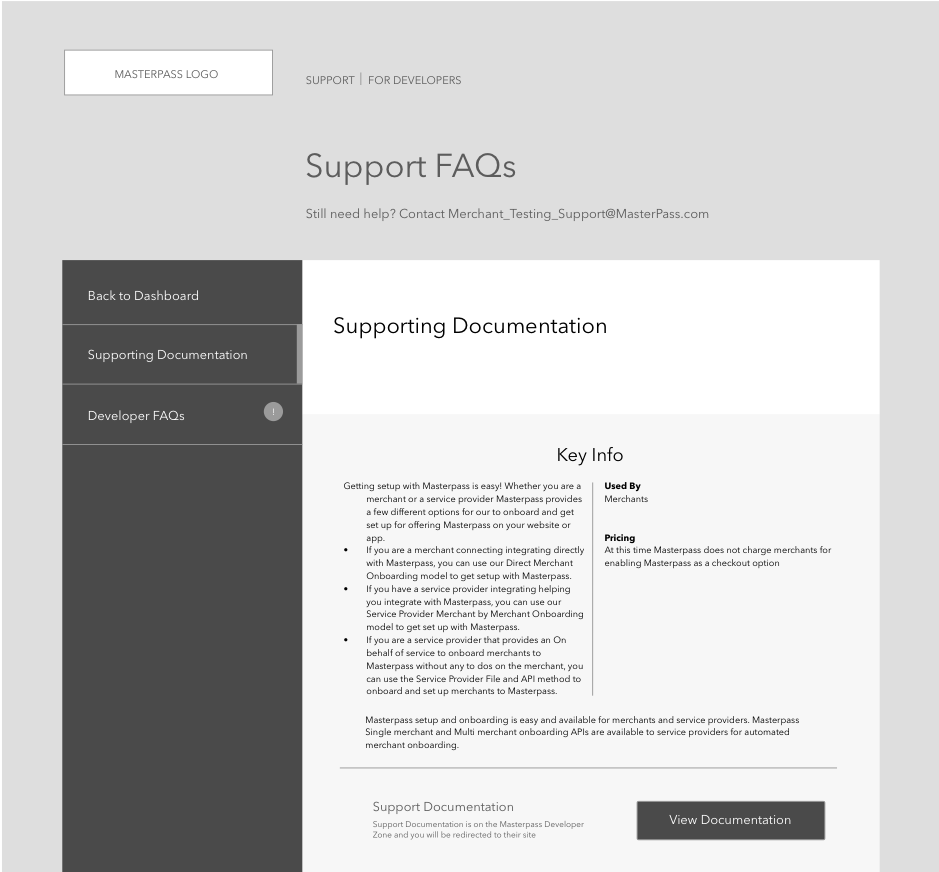
In the case where the user had issues or questions with their project implementation, there was a Support and FAQ page for them to access. The page seemed haphazardly put together, just dumping links to whatever may provide information to the user.
Where am I going?
Many of the links linked out to other Mastercard related sites as well, which led the user to disconnect from the merchant portal experience all together. For all technical support, the user was linked out to the Mastercard Developers platform, which was a different platform dealing with all API related technical inquiries and not just Merchant Portal specific.
Research
With all these issues around the Masterpass Merchant portal, there needed to be something done to provide a streamlined experience for our users. In order to do this, we began by researching the ins and outs of the internal organization and how our teams were communicating with our users, ultimately helping us identify who our users are.

We identified and restructured the user flow for what it takes for a user to get to completing the integration of Masterpass to their business. We then hosted a workshop with people within the company who had relationships with our customers to get their feedback on where the painpoints in the experience lied for the merchants.

The workshop lasted 2 days, bringing in teams from different regions to get the feedback we needed. A customer journey map was created from all the feedback, identifying where the painpoints lied and what kinds of user expectations there were at different moments.

Asking the right questions
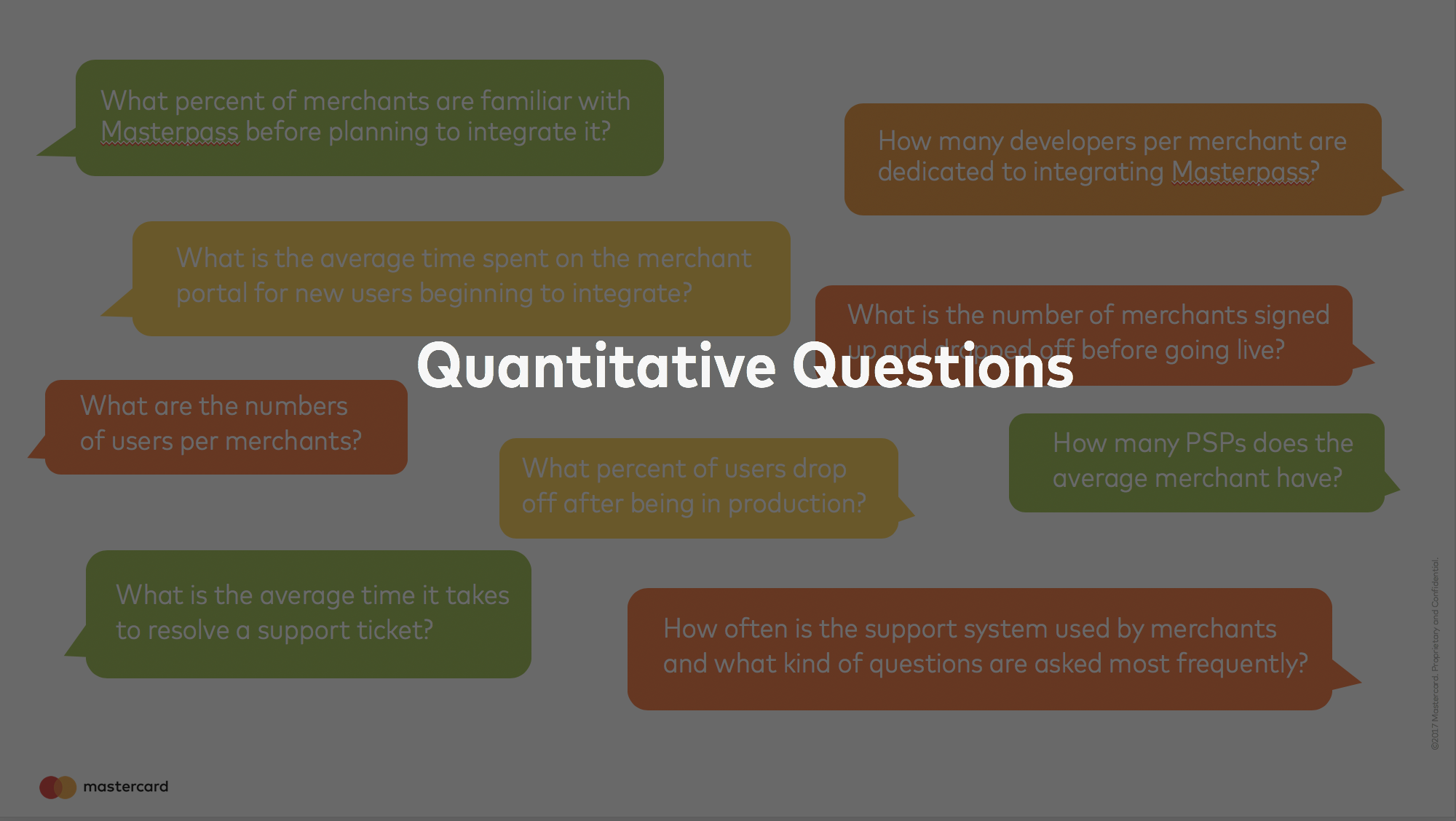
In order to better understand who our users are and what our relationships with them are, we came up with the right quantitative and qualitative questions. Quantitative questions were necessary to identify what data we had around our customers and to gather it to help make strategic design decisions, and qualitative questions were necessary to better understand who our customers are and so that we can better address their needs. All of the feedback we gathered helped inform the design decisions moving forward, but also helped in solidifying our argument in strategy and technical decisions that needed to be fixed before changing the skin of the site. These arguments required solid evidence to help us make the case because it would ultimately be asking for big product and technical lifts from many different teams.

We created user profiles for our internal teams that ranged from teams who regularly engage with our Masterpass merchants, to teams who work on the product teams delivering the Masterpass product.

The after state
After many months of research, deliberation, proposals, and designing, the Masterpass Merchant portal had gotten more than just a facelift. The entire portal was migrated to live among the Mastercard Developer platform after recognizing that our users were not just casual business owners implementing Masterpass on their own, but the users were actually developers. Whether it be 3rd party developers of the merchant, or an agile development team of a startup mom and pop shop, it made sense for the portal to live with the Masterpass APIs, where an implementation would begin with information on the product in a way that is tailored for a developer audience.

Dashboard Overview
Multiple users have access to the same Masterpass project. The users can range from business owners, to product managers, to developers. The dashboard shown to the user allows the different types of users to view the activity of all users on the project. The navigation on the right separates the different page settings depending on the user.
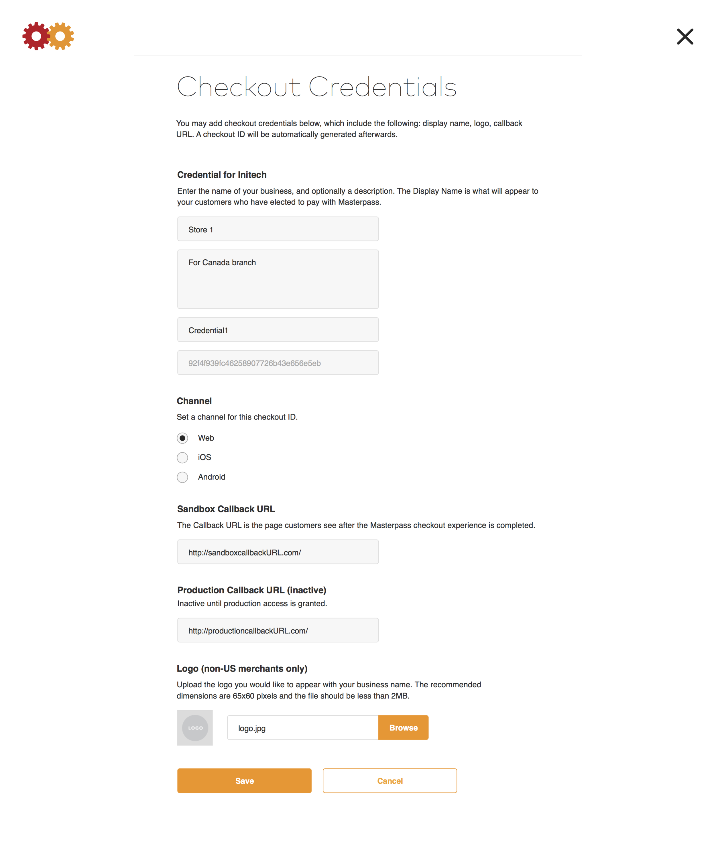
Implementation Modals
Merchants with many parts of their business that they need control over can be handled in the Checkout Credentials. Developers can determine where to begin the Masterpass experience. Other modals for completing other details are all part of the merchant portal which the account users will access frequently to edit their settings.
Moving to production
Once a merchant has prepared their implementation in sandbox and is ready to go live with the Masterpass implementation on their site, they go through a production access approval. Due to various complexities and regulations with payment implementations, there is a rigorous approval process that users must complete. In order to make the process as easy to follow as possible, the copy was carefully articulated and segmented in a checklist format so the user can complete the requirements painlessly.
